Case Study
quickMED
Designed for NYUAD students to connect with doctors quickly
My Role
UX Designer and UX Researcher
Tools Used
Figma, Procreate, Canvas
Problem Statement
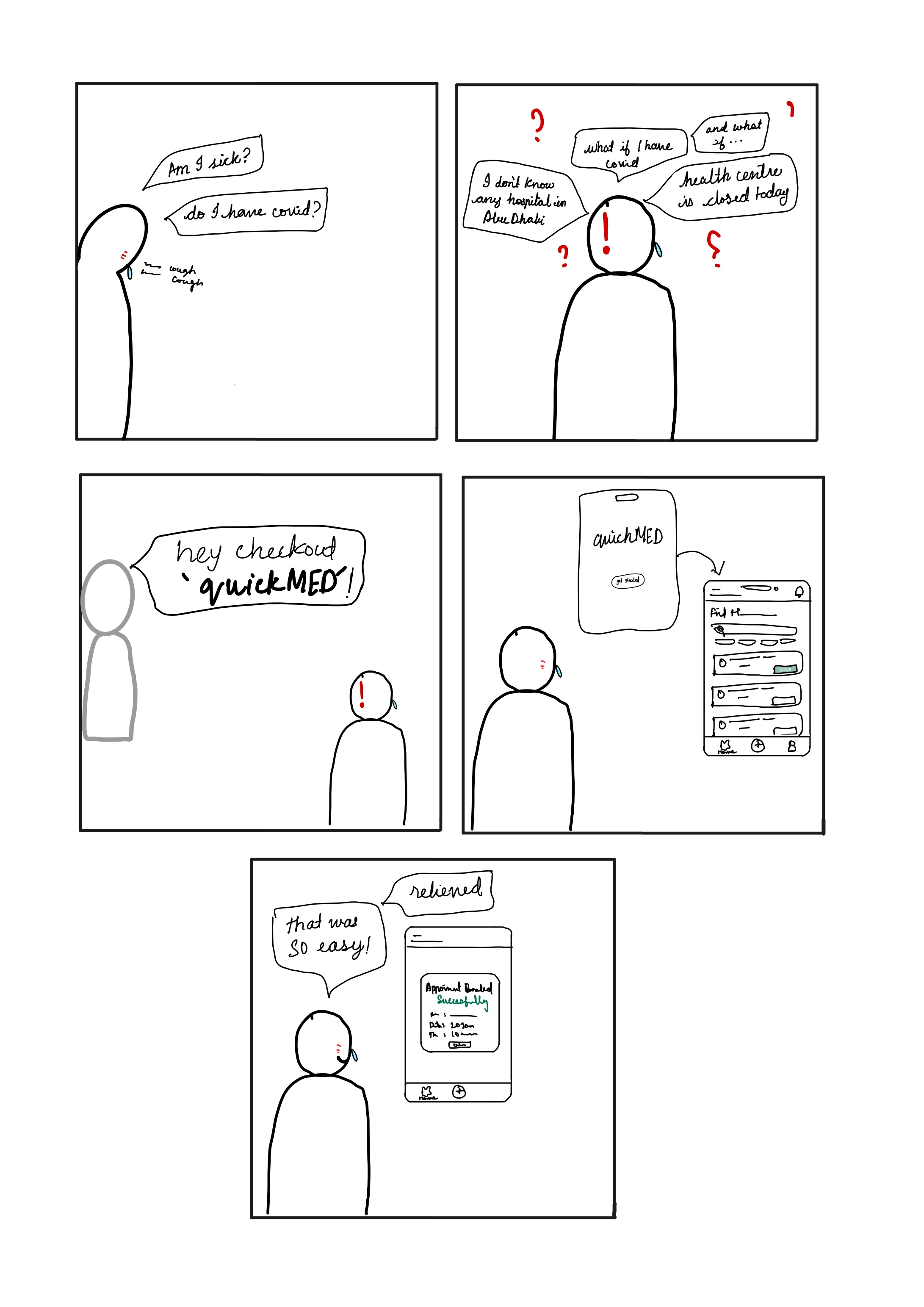
For students at NYU Abu Dhabi, especially international students, finding healthcare providers can be a daunting task. They often struggle with identifying the right resources and options when searching for doctors or scheduling appointments. Additionally, healthcare expenses can be a burden for college students, making it essential to find affordable options. Students typically seek recommendations on NYUAD Facebook groups or the Health Center, however, these methods are often inefficient, especially during emergencies or outside office hours, and provide limited information about pricing and insurance coverage.
With an increasing trend towards digital healthcare, this problem will only get worse over time.
Users and Audience
Survey Findings
I designed a short survey to evaluate student experience while booking appointments with healthcare providers on and off campus. This helped me define the users who will be the main audience of my application. Some of the survey findings are:


Personas
I created a persona based on the survey findings. It is a fictional character but an apt description of my users.

User Journey Maps
I designed User Journey Maps to understand the steps and the emotions involved when a user tries to find and book appointments.

Solution
The solution to the challenge faced by students at NYU Abu Dhabi, is to create a user-friendly central platform that streamlines the process of finding and booking appointments with healthcare providers. This platform would include filters for NYUAD recommendations, insurance coverage, and distance from the current location, providing a comprehensive and efficient solution for students in need of healthcare services.
Design Process
Future State Journey Map
The designed process involved designing a key user map or user flow of an average user or my persona when using the designed app.

Future State Journey Map Visual
The next step involved sketching out the journey flow to emphatize or relate with the user.
Competitive analysis
I conducted a Competitive analysis of the competitor apps in the market to learn from their design choices and to improve the designs based on their user experience.

Low level Wireframes and sketches
Then I drew some low-level wireframes to help design it on Figma.

Style Guide
I developed a style guide with colours, typefaces and button styles.

Testing
I tested this design by asking people to use the prototype as if it were an app and watching them navigate through it. Watching their reactions change helped me to analyze what design decision was effective or not. I then interviewed them about their experience.
During my first iteration, I thought let’s completely remove the home button. But talking about this design with one of my friends made me realize that people are customed to having home buttons in apps and might get frustrated by its absence. I then looked at the apps of my competitors and that idea was right.
Outcomes
Reflection, lessons, and next steps
This project helped me realise the importance of UI/UX. How often do we come across a design that is not user-friendly or accessible? Another thing is User research and testing. It is so important to collect data about people’s aspirations about features and apps and to continue testing them. Every person I spoke to had new experiences, new questions and new suggestions/things to add. This is also an important step in making design accessible, an issue I deeply care about.
My next steps are to keep on defining my designs. I would like to conduct more research particularly more interviews. One suggestion that came up during an interview was to have an additional filter to lookup for health conditions as one might not know which doctor to choose. This is something I plan to add. Another idea I am looking to implement is integrating maps/directions to help navigate to the location.